Showing posts with label Sheet Glass. Show all posts

Thursday, March 28, 2013

Fusing the Recycled Pendants

Alright, so I recently fused together a chunk of recycled glass (yesterday, actually) because I didn't want to throw it out. Since I'm a hasty person, I've already cut up all the glass and I'm ready to throw it back into the annealer!

Everyone, and I mean everyone, has said it looks like candy, to which I completely agree. The longer I spent time with it, the more I wanted to bite into it! Ahem, to be frank, at least three people have bitten it, just because for some reason you can't resist checking to see if it really is candy or not.

That's a good sign, right?


Definitely looks like something tasty you'd get out of a pinata. This is the most colorful recycling I've ever seen!


In this kiln I also threw in a quick color test! I've got my designs all troubleshooted for another series I'm going to start, so it's time to pick the colors (which is so scary).

The far left is Aquamarine Blue (G22) again, the second in is Dutch Blue (RW84), followed by Opaque Aquamarine (RW85) and Reddish Violet (RW88).


Thu March 28
Mercedes
1) 01 ↑ 745°
2) 11 @ 745°
3) 12 ↓ 516°
4) 1:12 @ 516°
5) 1:30 ↓ 390°
6) 2:00 ↓ 60°

I didn't like that the bumps from the saw were still protruding (the saw always takes an uneven chip out at the very end of the cut), so I sent them back up, this time to 750° for 10 minutes.

My absolute favorite is Aquamarine Blue, by far! The Dutch Blue follows up as being okay, just awfully purple. The Opal Aquamarine is awful though, it's very dull and I dislike that. I don't know when I'll ever have a reason to use it!

Recycle Glass By Fusing It Together

In an effort to be as sustainable as I possibly can be, and to have one of those dream Polyculture Studios one day, I decided that I absolutely could not throw out any scrap (except maybe tiny slivers that were going to slice my hand open).

I think I had known for a while that I was never going to condone throwing out scrap - I've been saving bits and bites all year after all. This was the first time an idea had actually taken off though. I knew that I didn't want to just throw scrap together and call it a pendant because that can look really awful sometimes, especially when it's tack fused. Don't get me wrong, it can look nice, but without proper rhyme or reason I would probably just create garbage.

So I decided I'd do my best to stack different layers of color up, then I'd fuse it, cut pendants out of it and fuse it again. Ideally when I have lots of scraps I want to make a really thick stack, so that my pendants can be 1" or 1.5" long, all with different colored, mish-mashed lines!


I forgot to take a picture of the orange layer, but it's Green-Yellow-Orange-Green-Pink.

I don't have enough scrap right now to make a piece that's an inch of horizontal lines, so I'll have to suck it up and cut these babies up vertically! Should be fine.


My fused block of glass was actually this tiny amazing thing that I wanted to keep as-is and carry with me everywhere. I've never had just - a giant chunk of raw, solid color before, there was something really nice about it.


I really dig the way the bottom looks the most!


(Click to check out what the colour bar looks like on the inside when I start cutting it up.)


Wed March 27
Large Paragon
1) AFAP ↑ 793° for 20 min
2) AFAP ↓ 516° for 1 hour
3) 15 min ↓ 390°
4) AFAP ↓ 50°

*Note: I'm not worried about proper annealing since I'm fusing/annealing these again. I just don't want them to break while I'm cutting them!

Monday, March 25, 2013

Black Powder Farm Silhouettes

On Friday I received an order of color from Sylvie at Colour Fusion - this included my Mocha Brown powder, as well as a blue powder that I'm blindly trusting. I talked with her about how I was having issues with my black, as all the blacks I knew of were reducing in the kiln. G50 was the last black I could try, but she didn't have it (or something, to be honest I can't remember). Anyway, when I showed her my failed tests, I noticed that one of the tests looked a lot better than the other, almost acceptable in fact. So, seeing as I have a half a kilo of black that I have to use SOMEHOW, I decided to give it a shot. These are some tests which compare white vs black powder, as well as a new shade of soft green that I grabbed at Fantasy in Glass. I was unsure of it before the firing, but now I think it's absolutely adorable.


Some of the black pendants came out better than others; a few looked like I had thrown black powder at the glass in a fit of rage or something. All of the black pendants aren't properly fused. That is to say, they are fused, but not fully so, so there's a lot of texture left behind. Maybe this is one of those times where you want a high temperature for a short time, to increase the aesthetics of these darn things.


I know, I know, bad photos, you can't quite see the difference between the shades of green - but there is one I tell you.


I would say that I should completely write off the black, but I'm sure that someone out there will want, and enjoy, those black bunnies instead of the white ones. Overall though I think I prefer the aesthetic of the white for two reasons;
1) I usually see black silhouettes on colored glass.
2) White is a happy, free and open color. It's much more inviting to the theme of sustainability and change.

Fri March 22, 2013
Mercedes
1) 1 to 755°
2) 11 @ 755°
3) 12 ↓ 516°
4) 1:15 @ 516°
5) 1:30 ↓ 390°
6) 1:31 ↓ 50°


Stamp Pendants; Low Temperatures/High Times

I have another set of new designs to show off - I really feel like silk screening is just my perfect thing. Which is odd, because I know you could use it with textiles or wood or anything else, so it's almost like it doesn't matter that I'm working with glass right now (regarding these things anyway). I think this is a good thing, actually, oddly enough. I think if I can pair my ideas down so much that they could be relevant and workable in any medium, then it means I've done my job. After all, my newly focused intent this semester is to create things that the average person, that anyone can relate to and understand. So if I create anything that's mind-boggling to the average person (because it's glass and glass is very enigmatic), then they're going to get distracted.

I know I suck at taking pictures, but this image isn't awful just because of me. The "Mocha Brown" powder was so pale that I could barely see it - I was really terrified it would turn out looking like this!

Anyway, back on track, this new design theme is stamps. I was pondering Charon's Obol and wondering, when we die, what we would pay the ferryman to cross the river styx. My best modern conclusion was stamps. The ferryman is like a postal man because he's delivering our soul somewhere for us, and what do we put on all of our postal packages to make sure everyone knows they're paid for? Stamps.

Vaguely in the bottom left you can see the US flag, followed by Earth and a maple leaf.

To start with I put together some very basic imagery of Canada, the US and Earth, going off of the fact that your stamp always says something like, "Canada Post" on it, to tell you where it's from. I thought of this as making sure the ferryman knows where you're from, or where you want to go, based on your identifying stamp.


There we have it, they turned out o-kay! Yes,  yes, bad camera photos and all so they look a bit burnt, but the true colors look awesome together! I'm really, really pleased with the way these turned out, and so happy that Fantasy in Glass happened to be giving away one cream sheet for every three sheets of glass you bought :) Freebies are the best! The official name of this brown, even though it looks awful in that photo, is Mocha Brown (RW 224).

Then we move on to more farm and hobo pendants, yaaaaay ~ 


I can't tell you how excited I am about the fact that I'm getting better at lining these guys up on center! It's still hard because there's a few different factors, but I'm getting it. My genius idea (if I may say so), to place a printed copy of the silkscreen down, with outlines of where each pendant should perfectly go - that really makes my life easier! I suggest it to anyone who ever wants to silkscreen something small, because it can be a trying experience.


The unusual thing about this kiln program is that instead of firing at 740°-760° I only fired at 700° - but because the glass sat at that temperature for an hour, the edges rounded out a lot more than they do at say, 10 minutes at 740°. I can't say whether there's a benefit to holding at a low temperature for a long time, or a high temperature for a short time - they both take up more power in their own way.


Fri Mar 22, 2013
Large Paragon
1) 9 hours ↑ 600° for 2 hours
2) 1 hour ↑ 700° for 1 hour
3) AFAP ↓ 515° for 2 hours
4) 4 hours ↓ 390°
5) 8 hours ↓ 50°

Unfortunately I messed up and thought that the first step of the Paragon is say, "How many hours to this temperature?" When in reality it's, "How many degrees an hour to this temperature?" meaning that the program ran up a lot faster than it was supposed to (sorry Roxy), but everything did work out.

New Farm Animals; New Hobo Signs

Jeez, I've got new pendants going on already! Clearly I didn't have enough farm spirited designs before, so I had to go make some more up! There's an awful lot of bunnies, and no it isn't because of Easter haha. I just happened to find a fantastic source for different bunny poses, so who could resist?

Along with that, you can see that some of the black tiles have neat little stick drawings on them (cough, that means not the black tiles with horses). Those, my friends, are called hobo signs, and they're part of a project I'm working on. Each sign has a different meaning, and homeless people use them as a means to help guide each other through their respective towns. They do chalk images so that they can be changed at any time (I assume), because some of the labels are much more serious than mine. They can signify dangerous zones where you should run away as soon as possible, or areas where you should be prepared for a fight if you stick around.


My symbols mean the following (from left to right of the first image);
Top Hat: Gentleman
Two Vertical Lines: Sky's The Limit
Two Circles: Don't Give Up
Cat: Kind Lady
Circle with an X: OK To Hang Out (May Get Food)

Thur March 21, 2013
Mercedes
1) 1 ↑ 760°
2) 11 @ 760°
3) 12 ↓ 516°
4) 1:12 @ 516°
5) 1:30 ↓ 390°
6) 1:31 ↓ 50°

To be perfectly frank I can't remember the exact annealing cycle I used for these pendants, but I do know that I sent it to 760° - which is the important part to me. I don't quite like how rounded they are. Paul commented that there's something nice, almost more professional about the pendants that are still squared off. Not only that, but at this temperature the glass started grabbing at the kiln wash/ kiln shelf and the backsides all need a quick run on the polishing dremel. The other pieces didn't need it nearly so much.

Fusing Recycled Glass; Green Test; Firing Pendants

This firing had a few different things going on inside of it.

First; a small run of regular green farm pendants, so I can appropriately note the firing temperatures.


Second; I want to do a series of farm-friendly words that are green powder on clear glass. Roxy let me try out two of her colors. The one on the left is Dense Green (RW 75) (also known as 'Medium Green Yellow on Colour Fusion) - I love it, but it's too limey for this specific intent. I really want to keep track of this color for later though! The color on the right was Celadon Green (G 135) - I suppose I underestimated how delicate the color was and didn't put nearly enough on, so you can barely even see it!

I'm glad Roxy let me test run her powder, because RW 75 was the exact color I was going to try for! The solid glass version looks just like my green farm sheet glass. Either that, or the label is wrong, I won't know for a long time haha.


Third; When I popped into the charging room one day I found a beautiful sheet of fused glass, one that Paul didn't like and was just going to chuck into the furnace. For Gaffers (our fundraising group at school), I cut up the glass and threw it into a kiln so we could make some neat, recycled pendants!


I should note that this glass was so thick from being fused together that I couldn't score and cut it - I ended up taking it to the wet saw and just slicing it up at random.

As you can see there's no holes in them yet. This is just after I pulled them out of the annealer so they were still warm.


The annealing schedule, unfortunately, is completely unusable! I didn't realize it for a long time, but I hadn't properly shut the door of the Large Paragon, so the kiln kept giving up at about 500 degrees and crashing back down. I thought the poor annealer was on it's last legs or something, and I kept changing the max temperature and sending it up and up and up (of course it wasn't actually going up). The last schedule I was on before figuring out my issue was;

Wed March 20 / Thur March 21, 2013
Large Paragon
1) AFAP ↑ 770° for 40 min

- and then I checked on the kiln and holy moly it was hot hot hot! Everything looked plenty melted so I just crashed that baby right down to 516° and ran it on a regular annealing cycle.

Unfortunately for me, the Large Paragon has crappy digitry, and many of the little lights are burnt out, so I don't know exactly what temperature it was at, or if it was at 770 and had been on hold for a little while.

Thursday, March 7, 2013

Orange Citrus!


Continuing with the citrus theme I finally got some orange glass from FiG! With this I have orange, lemon, lime and grapefruit pendants on the go - I'm so excited!

Now the big problem is going to be mastering the skill of getting all of these tiny guys lined up and on center. It's good and bad: Bad because the pendants are small so they're hard to line up through the screen, good because that small size means I can easily run 30 at once, and bad again because that means I can mess up 30 pendants at once <_>!

Either way, after mastering the art of screening 1.25" circle pendants, I bet all other screens I make up will be a breeze!


Wed. Mar 6, 2013
Mercedes

1) 01 ↑ 747°
2) 10 @ 747°
3) 11 ↓ 516°
4) 1:11 @ 516°
5) 1:30 ↓ 390°
6) 2:00 ↓ 50°

Going from 745° to 747° seems to have been the tiny push too far. The sides look great, but the little bits on the back edge were actually a bit sharp this time. This change could be from using a different color and not from the temperature.

An important note for later is that thanks to the glorious benefits of photos I just realized that firing at 747° in the Mercedes isn't too high (as I thought it was in this firing). No, in reality I just had some chip outs that perfectly imitated glass sides that got too hot.. Oops!

Wednesday, March 6, 2013

Grapefruit Fusings!

A friend kindly pointed out to me that if I use pink glass, I can use the exact same pattern to make grapefruit. I really hate grapefruit so I never thought about it, what a great idea that was! So, the day after the last fusing I put these cute little babies in. I'm working hard to perfect the ability to center my pendants, but it might be a little while. At this point I think it will just take some experience, some time to get used to what I'm doing, and then they'll aaaaaaaaaaall be centered!


I didn't post these on Monday night because I was at school until 12:30 AM, and on Tuesday I simply forgot (ha). Still, I'm working hard to post things as they happen, and just edit in the finished photos later.

Mon. Mar 4, 2013
Mercedes

1) 01 ↑ 745°
2) 10 @ 745°
3) 11 ↓ 516°
4) 1:11 @ 516°
5) 1:30 ↓ 390°
6) 2:00 ↓ 50°

Sunday, March 3, 2013

Farm + Citrus Fusings

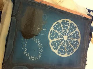
This is my first attempt at screen printing my pro-farm designs, as well as my first attempt printing on circles!

I had a lot of issues with the farm pieces because my screen had a little more give than I realized, so I couldn't get the pieces in the middle of my screen properly. Two sheets of cardboard were perfect for the pieces on the bottom, but three sheets were needed for the rest of the designs. All of them had three passes, yet the pieces that had three sheets of cardboard were a lot thicker - more so than my liking - than the first pieces.

I really like the way the pig looks, how you can almost see the outline of the screen mesh, and how the image looks almost worn out. Worn out imagery always reminds me of farms for some reason, but I'll see how it turns out before I make a whole bunch of them.

I am really excited and proud of these two fused series that I'm starting right now!


Sun. Mar 3, 2013
Mercedes
1) 01 ↑ 740°
2) 10 @ 740°
3) 11 ↓ 516°
4) 1:11 @ 516°
5) 1:30 ↓ 390°
6) 2:00 ↓ 50°

I'm unsure about what temperature to fire at in the Mercedes. 745° was too high, while 743° in the Large Paragon was perfect. Previous firings had led me to believe that the Paragon was actually hotter than the Mercedes, so I am a wee bit confused right now. I settled on 740° to be safe, better to fire twice than lose everything, right?

Wednesday, February 27, 2013

Citrus Test 3

This was my third test with my citrus pieces. They're lined up nicely now on 1.5" squares, though that may be a bit big. It's been brought to my attention that I should really try drill pressing out circles instead - so I will.

The black I used was RW54 black and it reduced, unfortunately. Looks like I can't use it in the future, unless maybe I put a layer of clear glass on the colored sheet glass. Double the glass is double the cost though, so I'd rather not have to. I'm going to try G50 black next time.


Wed. Feb 27, 2013
Italian
1)   300 ↑ 1275° for 10 min
2) 9999 ↓ 900° for 60 min
3)   100 ↓ 700° for 01 min
4) 9999 ↓ 70° for 0 min

This schedule can't exactly be trusted - at all - because the Italian misfires by at least 60° - Megan believes it could be as high as 200° off though.

Citrus Test on Black Glass

Another quick test, mostly to allow myself to feel productive one Sunday evening haha. I also wanted to see how my thin prints would turn out on black, and how hard it would be to align them in the center one at a time. Clearly, it was impossible. While I do like the uniqueness of having a design thrown wherever it wants to be, I decided that in the future I'll lay my screen out so that 1.5"x1.5" pendants, butted perfectly against each other, will result in all of the pendants being centered at once. In theory anyway.


I'm confused about why I wrote the schedule the way I did, because I know for a fact that I was running these pendants in the Mercedes, not the Paragon. Perhaps it was to save on writing space/time.

Mon. Feb 18, 2013
Mercedes
1) FULL  ↑ 743° for 15 min
2) FULL ↓ 516° for 60 min
3) 1 hour ↓ 390°
4) 30 min ↓ 50°

Citrus / Fruit Screen Printing Test

Armed with new knowledge for how to screen print powder - which gave me the confidence I might have been missing to start a new project, I went ahead and made my own screens, then began a print test!


The above was three passes of powder, which clearly wasn't enough around the edges.


The above was two passes with powder, because I was a little worried that three would be too much. Silly me, but now I know!

A kiwi and apple, I think they would have been lovely, if not for the reduction quality of the black powder that was available. It sort of made them look like someone traced around all the edges with graphite. These shades of green look really different but that might just be the different crappy cameras.

I think my citrus pendants turned out perfectly! I even enjoy them despite the fact that they are so clearly off center hahaha.

This is my test for a 4" kiwi coaster, again,t he black sort of ruined the results, so I don't know how good the design actually is; if I need less powder; if I need a lower melting temperature.

Sun. Feb 17, 2013
Mercedes
1) 1 min ↑ 745°
2) 10 min @ 745°
3) 11 min ↓ 516°
4) 40 min @ 516°
5) 60 min  ↓ 390°
6) 1:10 ↓ 50°

Marbled Pendants Green & Pink

This was a quick test for faux marbling on different colors. Unfortunately the 'black' didn't look very good in the end, it got an awful sort of dark green tint in it that I did not want. As well, despite using Ox Gall and fresh glue, I didn't get the movement that I got before with the white and blue pendants. So sad.


Feb 13, 2013
Large Paragon

1) FULL ↑ 760° for 15 min
2) FULL ↓ 516° for 60 min
3) 1 hour ↓ 390°
4) 30 min ↓ 50°